For part 1 in this series, we're looking at a fake login page.
https://gixon[.]sbs/_wildcard_.gixon[.]sbs/views/
You can learn a lot from the URL before you even load the page.
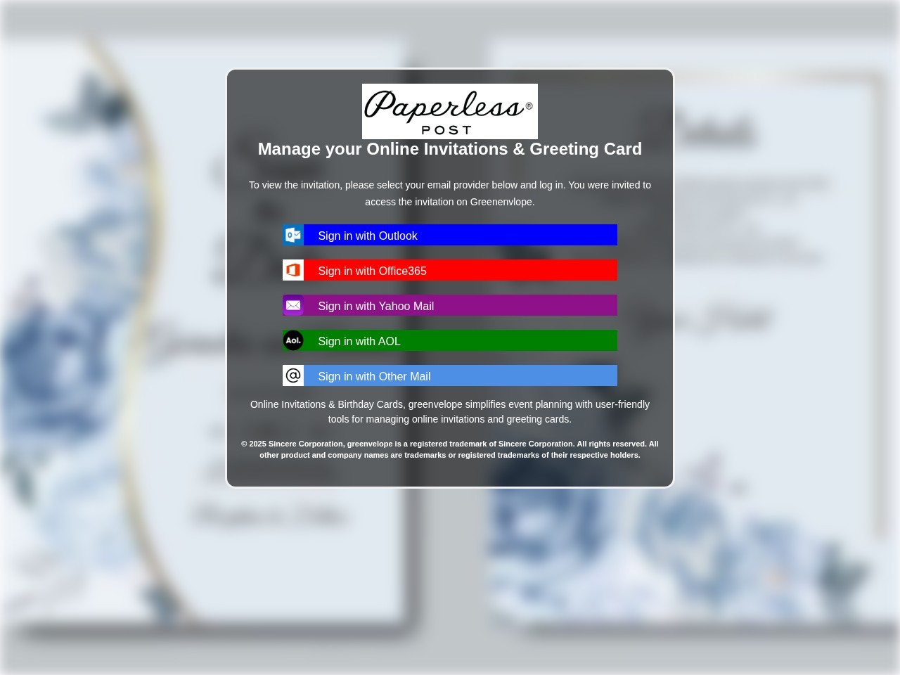
Screenshot of the captured page. It presents itself like a Paperless Post invitation flow while pushing the visitor toward mailbox-provider login buttons.
Start with the mismatch
The page tries to look like a Paperless Post invitation flow. The domain is gixon.sbs.
That mismatch is the first thing to check in a phishing review:
- what brand is the page claiming to be?
- what domain is it actually on?
- do those two things belong together?
Here, they do not. The copy and branding point one way. The URL points somewhere else. That is enough to get suspicious fast.
Paperless Post's own help guidance says real invitation links should come from official Paperless Post domains such as paperlesspost.com, pp.events, or links.paperlesspost.com, and real invitations do not require a mailbox login just to view a card. A login gate on gixon.sbs is nowhere near normal.
That _wildcard_ path is weird for a reason
The path is doing some of the work here:
/_wildcard_.gixon.sbs/views/
That is not a normal public path for a consumer invitation product. It looks more like an internal routing artifact that leaked into the final URL.
When you see something like this, a few possibilities usually come to mind:
- a phishing kit sitting behind wildcard host routing
- a reverse-proxy or shared hosting setup exposing internal names
- a cloned template dumped into a generic
viewsfolder - a rushed campaign that never bothered to clean up the public path
None of that proves phishing by itself. But legitimate consumer apps usually do not leak infrastructure details into user-facing URLs. Kits do.
The real goal is email access
The page shows fake invitation UI with buttons like:
- Sign in with Outlook
- Sign in with Office365
- Sign in with Yahoo Mail
- Sign in with AOL
- Sign in with Other Mail
That is the tell.
A real invitation page should show the invite, let you RSVP, or maybe confirm who you are through the service that sent it. It should not push you into picking a mailbox provider and typing email credentials just to see a card.
This is not identity verification. It is credential theft with a nicer background.
The brand mix is sloppy
The screen uses Paperless Post branding, but some of the surrounding copy references Greenvelope.
That kind of brand bleed happens all the time in phishing kits. Operators recycle templates, logos, screenshots, and text from old campaigns. At a glance, the page can still feel believable. Look closer and the seams start showing.
Things worth flagging:
- one brand in the logo and another in the body copy
- one company in the copyright line and another in the CTA
- mixed product names in headings, buttons, or labels
- asset names or alt text tied to a different brand
Real products make mistakes too, but this kind of mismatch is common in cloned lures.
The layout is built for momentum
The page uses a blurred invitation background, a centered modal, and instant mailbox-provider choices. That is not accidental.
The goal is to keep the visitor moving. Familiar brands lower suspicion. The modal keeps attention on the next click. The whole page is trying to get a password before the user pauses long enough to inspect the URL.
That is a good rule in general: phishing pages often optimize for momentum, not accuracy.
The bot challenge matters too
At the time of review, the live URL returned a "Just a moment..." challenge instead of the open phishing page.
That matters because phishing operators increasingly use gating, interstitials, referer checks, and traffic filtering to slow down scanners and researchers. So:
- the page a human sees may not match what a crawler sees
- some kits only render for certain user agents, geographies, or referrers
- screenshots matter because live content can disappear or change fast
A challenge page is not proof on its own. Plenty of normal sites use them. In this case, it is just one more clue sitting next to the domain mismatch and the fake mailbox-login flow.
The .sbs TLD is context, not the verdict
The .sbs ending does not make a site malicious by itself. But it still belongs in the review.
Attackers like cheap domains, fast turnover, and naming patterns they can replace after a takedown. So the TLD is supporting context. It should not carry the case on its own, but it also should not be ignored when it shows up beside the rest of this.
What I would inspect next
If this landed in a trust and safety queue, I would want:
- the full redirect chain
- WHOIS and DNS timing
- TLS certificate metadata and SAN overlap
- final HTML, form actions, and JavaScript targets
- screenshots from different user agents or geographies
- historical copies of the title, favicon, and page text
- confirmation of whether the page changes when email-specific parameters are present
That is how you move past "looks bad" and into evidence you can act on.
Why this one is phishing
Put the signals together and the story is pretty straightforward:
- the brand and domain do not match
- the path leaks suspicious routing structure
- the page pushes mailbox-provider logins instead of invitation details
- the template mixes brands
- the live site appears to use gating that complicates review
No single clue has to do all the work. Together they are enough.
Final takeaway
What makes a page like this dangerous is not that it looks perfect. It is that it looks familiar enough for somebody to keep going.
That is why URL review needs to focus on structure, not vibes. The mismatch, the path, the credential prompt, the mixed-brand leftovers, and the gating behavior all point in the same direction.
LinkShield is built for exactly that kind of review. It resolves the URL, inspects the page, captures the structural signals, and gives your team something stronger than a gut feeling. If you want to try it, sign up for LinkShield.